SHELETSEE
诗兰仕
气垫系列产品
Idea
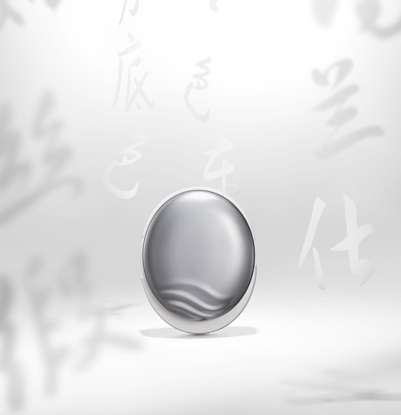
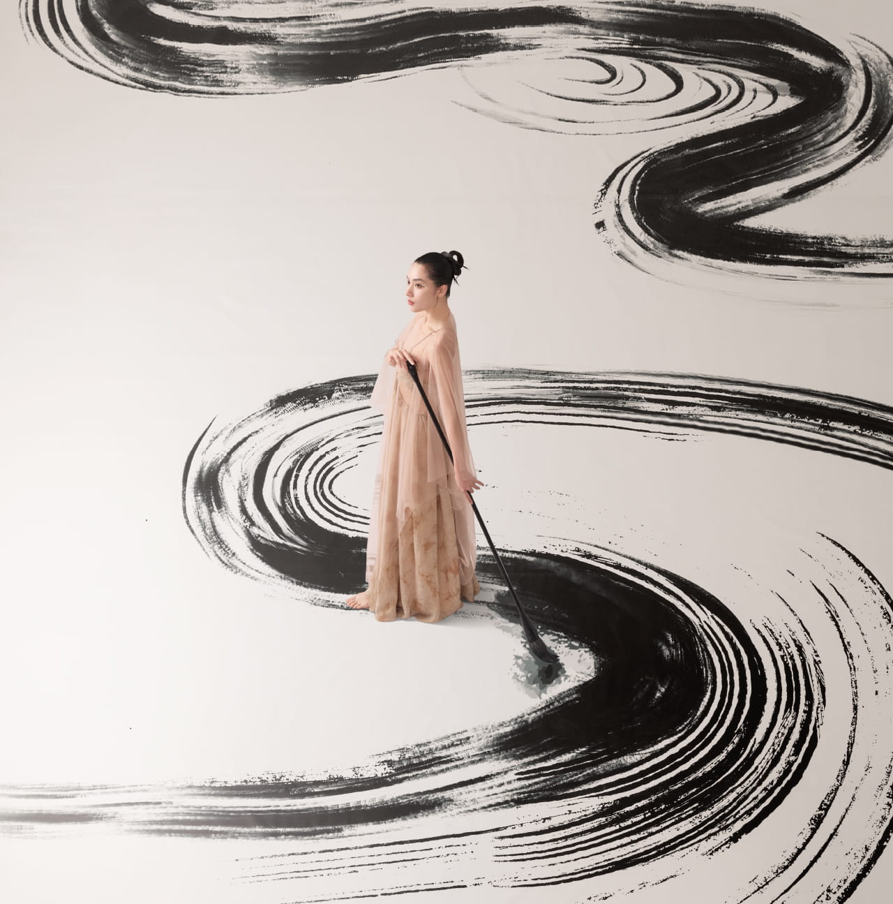
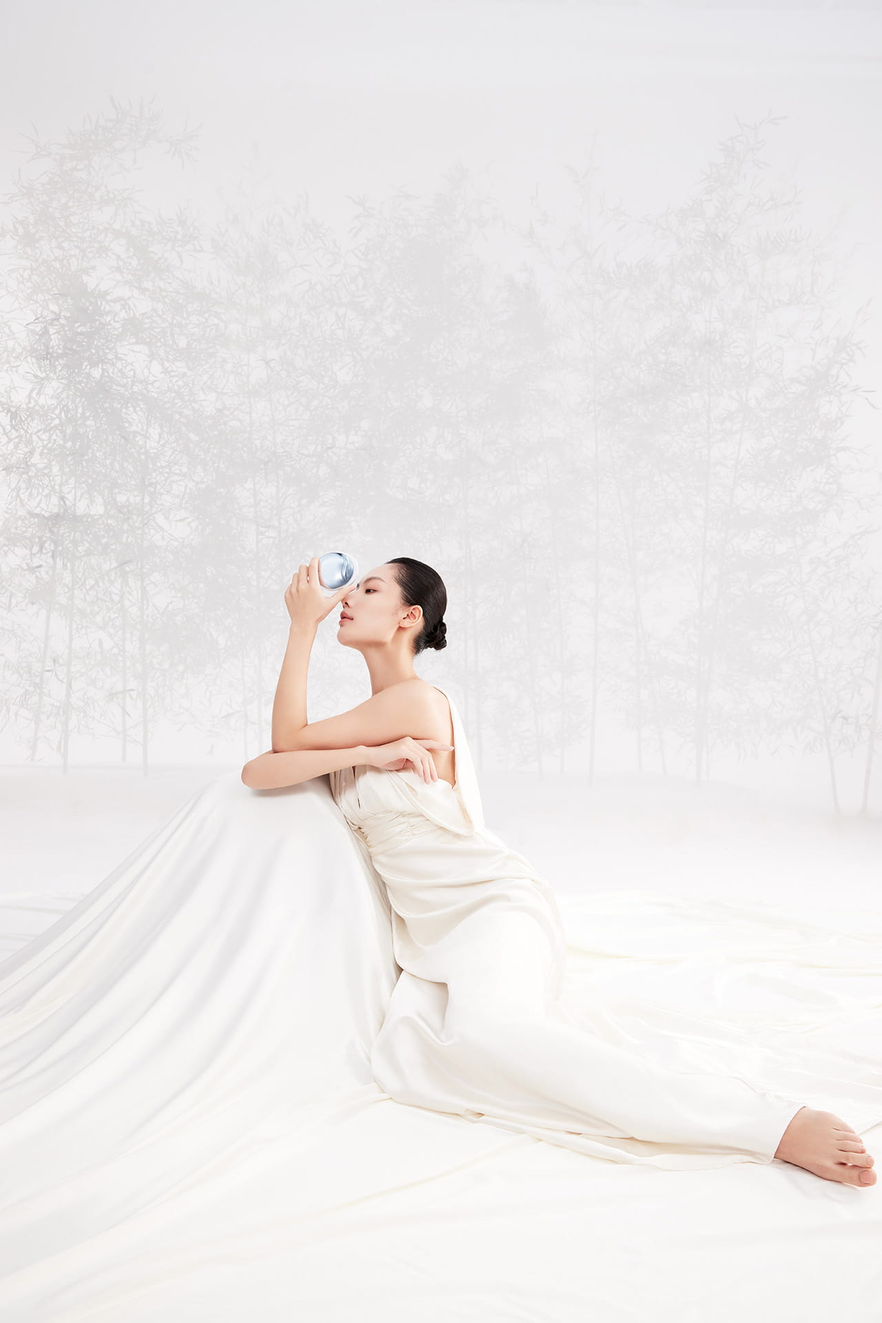
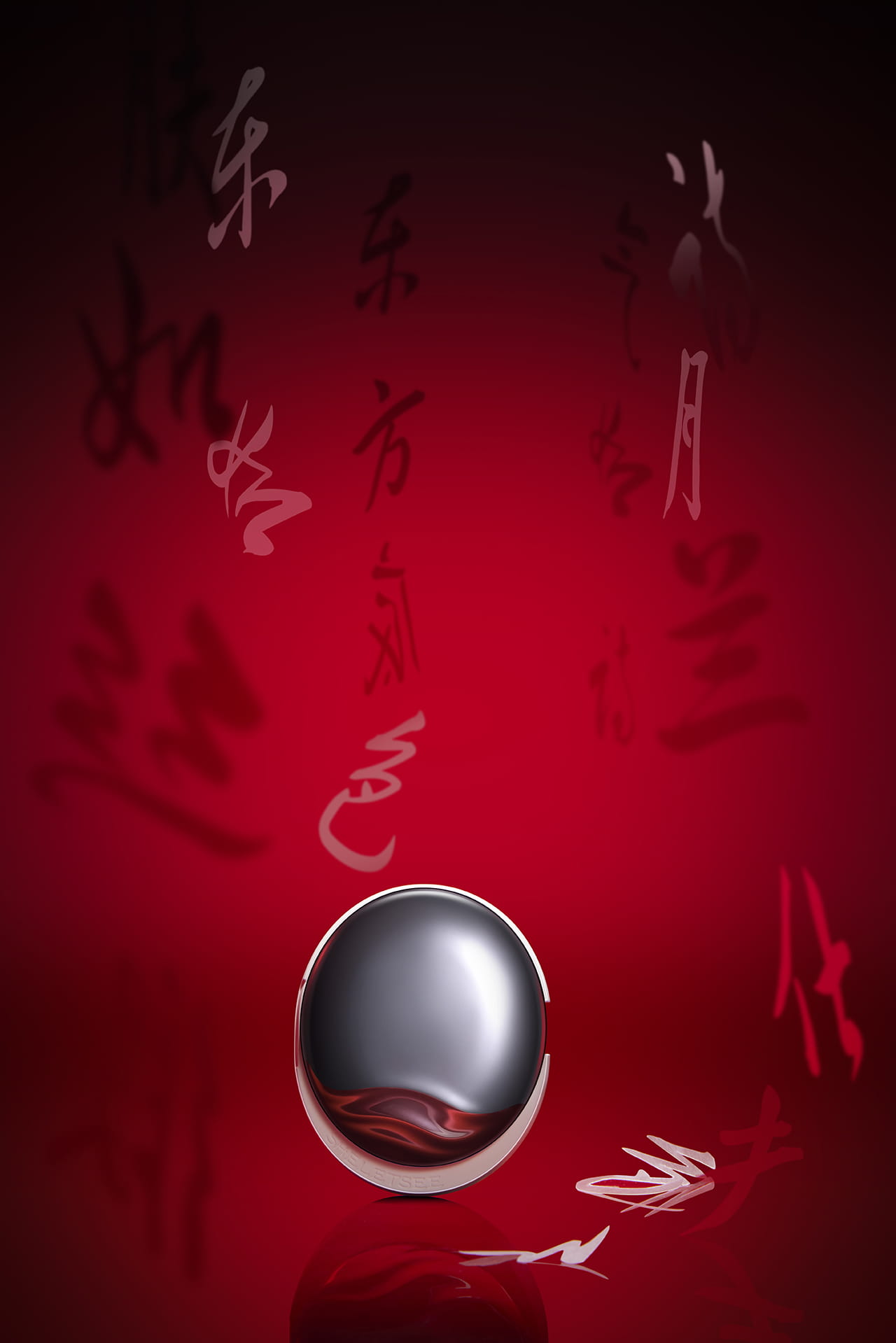
This cushion series is specially developed for Eastern women. Its packaging, drawing inspiration from “exquisite silk satin with flowing luster”, aims to suggest that the products enable a silky smooth finish for the skin and convey Eastern poetic aesthetics, whereby to heal both the face and emotions of users with sensitive skin.
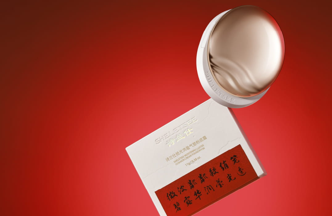
The top cover adopts aluminum anodizing technology to fully replicate the luster of silk satin, representing the skin-brightening effect of the products. Three simple, fluid lines resembles fluttering silk satin, which embody the products’ smooth, delicate texture and light weight. The undulating lines paired with a rounded shape bring to mind the image of a luminous moon reflected in rippling water, aligning with the gentle beauty of Eastern women.
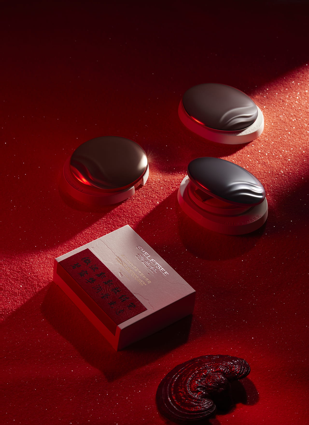
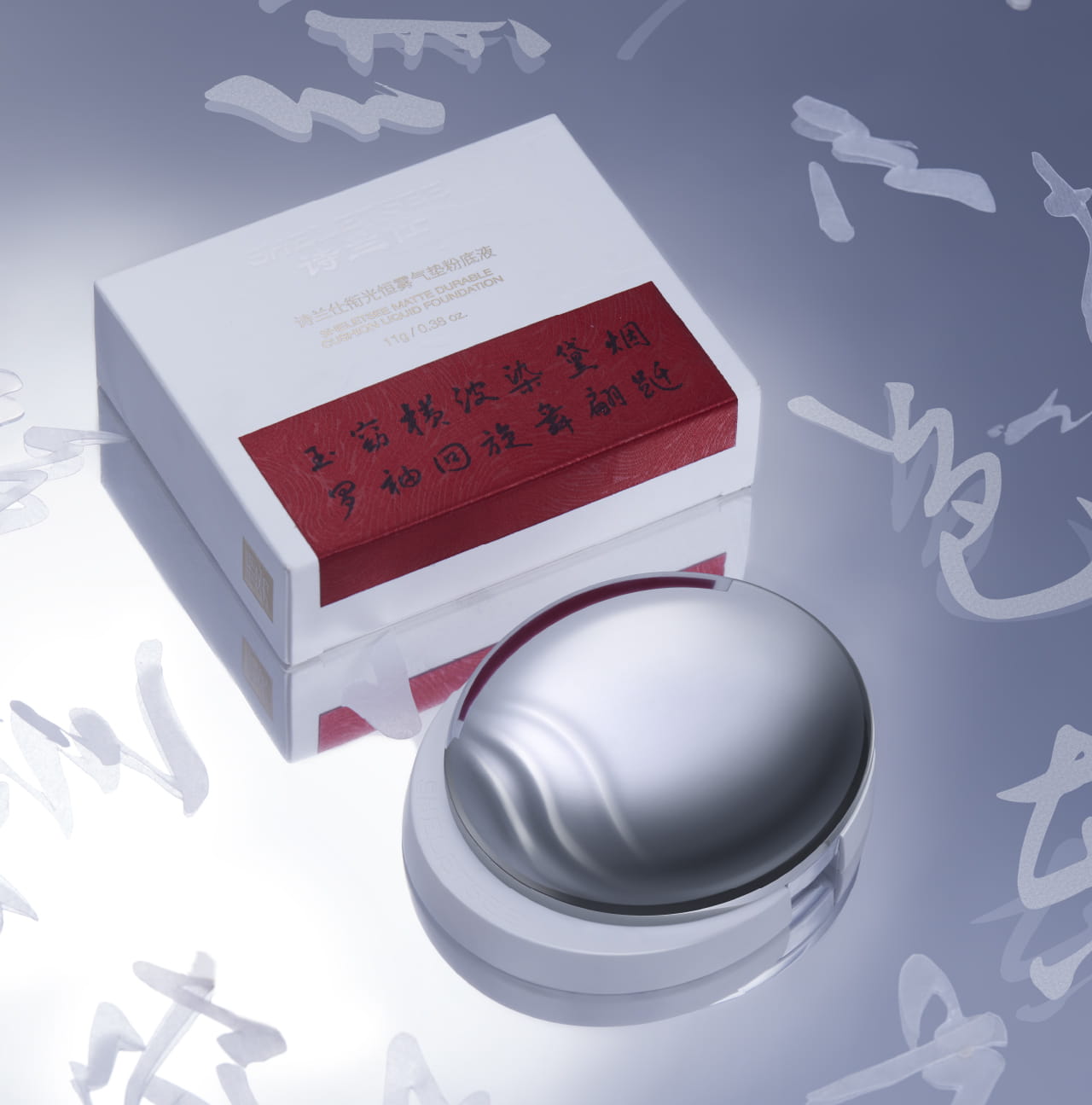
The flat oval cocoon shape with the moderate width better fits the hand of Eastern women. Products for different skin types are easily differentiated by varied colors of the packaging, so that users can visually know their distinctive core functions.
The outer box employs traditional fabric applique technique and a poem that explains the product features, to further highlight Eastern aesthetics.
设计理念
这一系列气垫产品专为东方女性研发,其包装以“光影下流动的精致丝缎”为灵感,旨在传达产品细腻丝滑的妆效以及东方诗性美学,赋予敏感肌用户面容与情绪上的双重治愈。
为了充分还原丝缎富有光泽的质感,上盖采用金属铝件氧化工艺,呼应产品焕亮肌肤的功效。三条简洁流畅的线条营造丝缎飘逸的效果,寓意产品将为用户带来轻盈流畅的上妆体验。
且起伏线条搭配圆润外观,令人联想到水中月,营造水波荡漾、月色莹洁的意境,契合东方女性的柔美气质。
同时,整体造型采用宽度适中、高度较小的椭圆茧型,更贴合东方女性的手握大小。
而对应不同肤质的包装采用不同配色,使用户直观感受对应产品的核心功效。
外包装盒则采用传统的贴布工艺以及说明产品特色的诗句,进一步强化产品蕴含的东方美学。