SANSEN
三生花
香氛身体护理系列
Idea
The packaging, designed for the fragrance body care product series, aims to convey the brand’s wish that users can blossom for themselves like flowers.
The products extracts floral essences through a special technology, combining scientific ingredients with fragrance of flowers to heal both the body and mind of users. Considering that, the packaging for the body lotion is designed as a four-petal flower bottle. This not only visually shows the core ingredient and fragrance source, but also ensures a comfortable grip and stable placement.
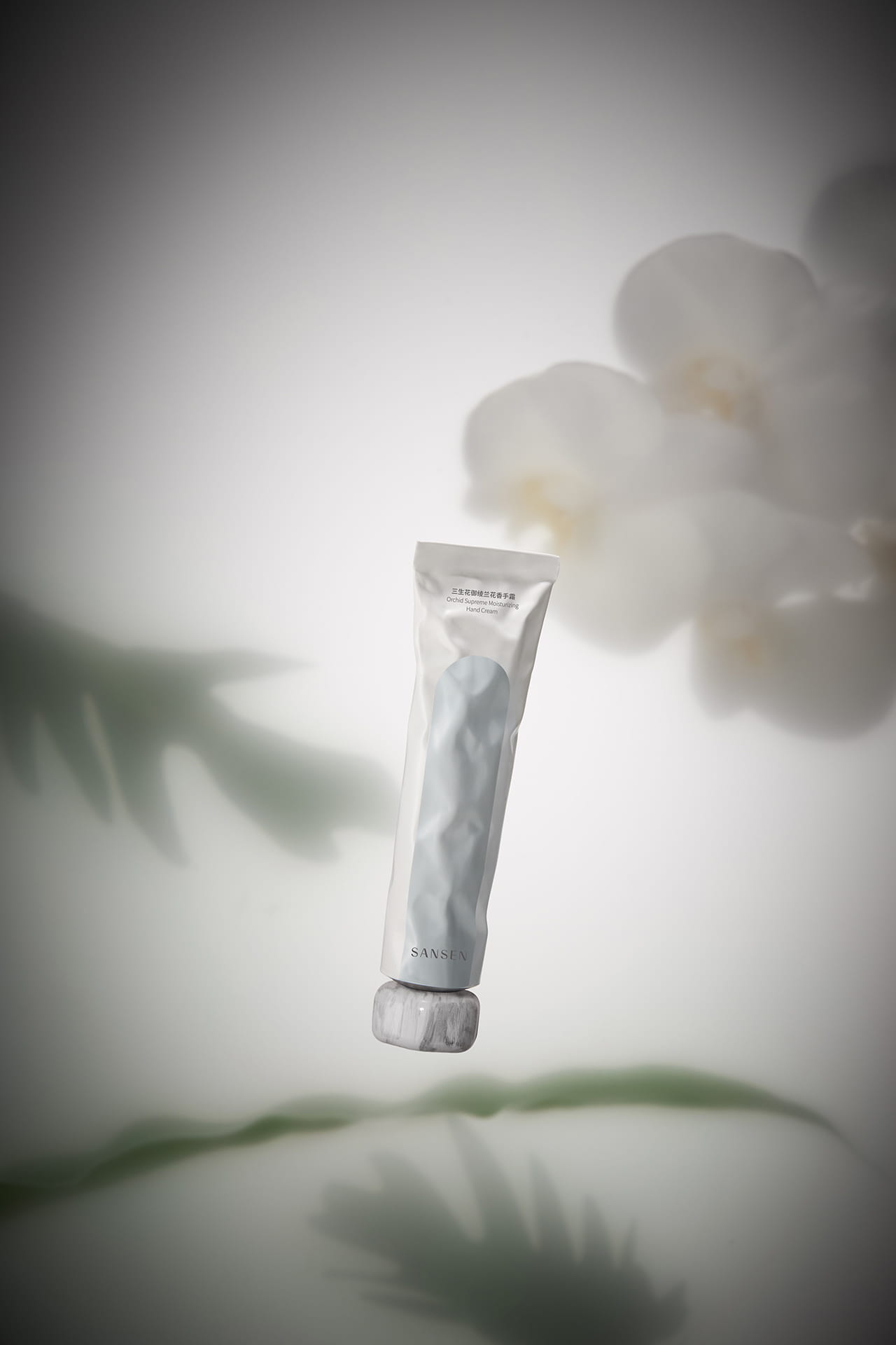
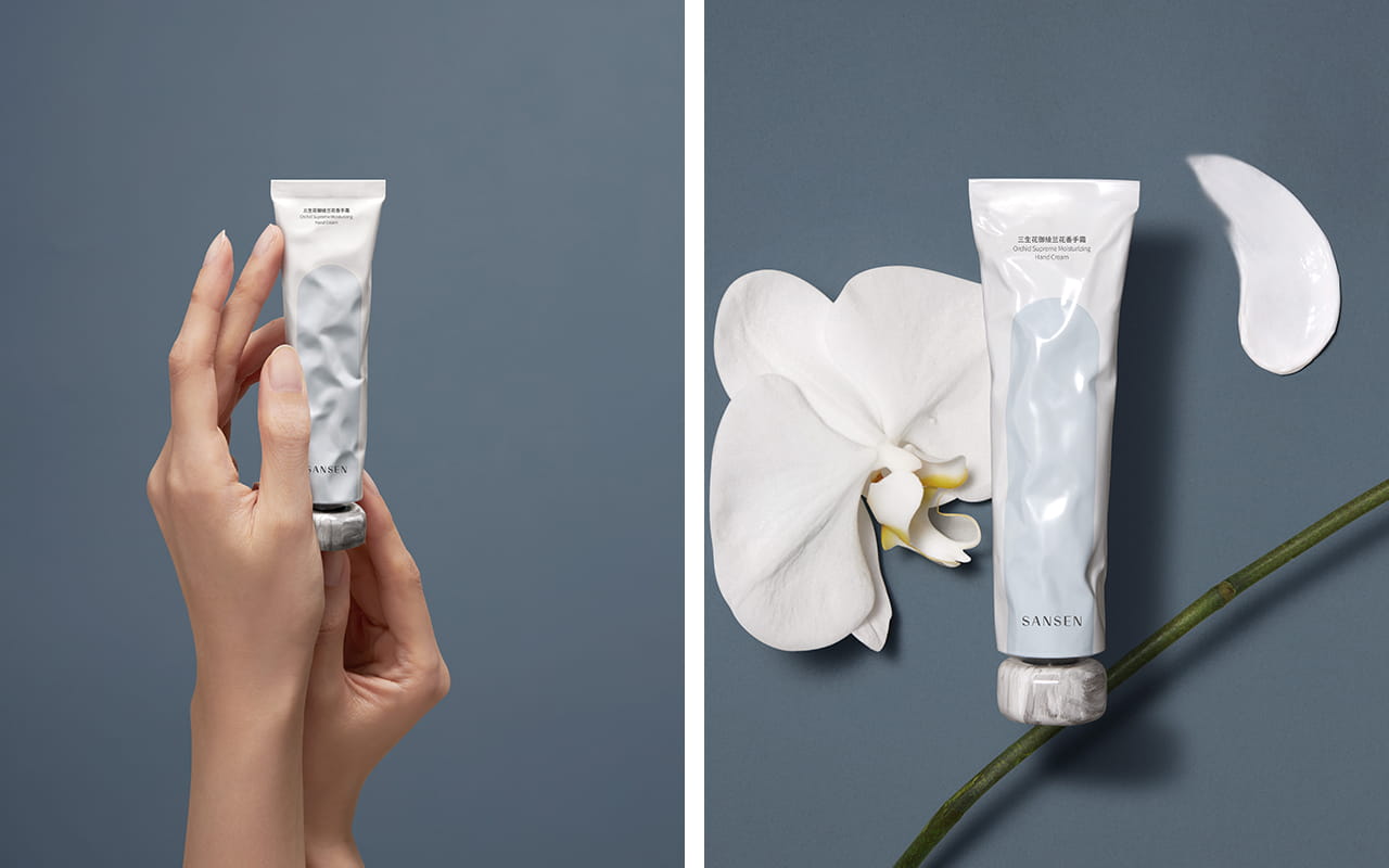
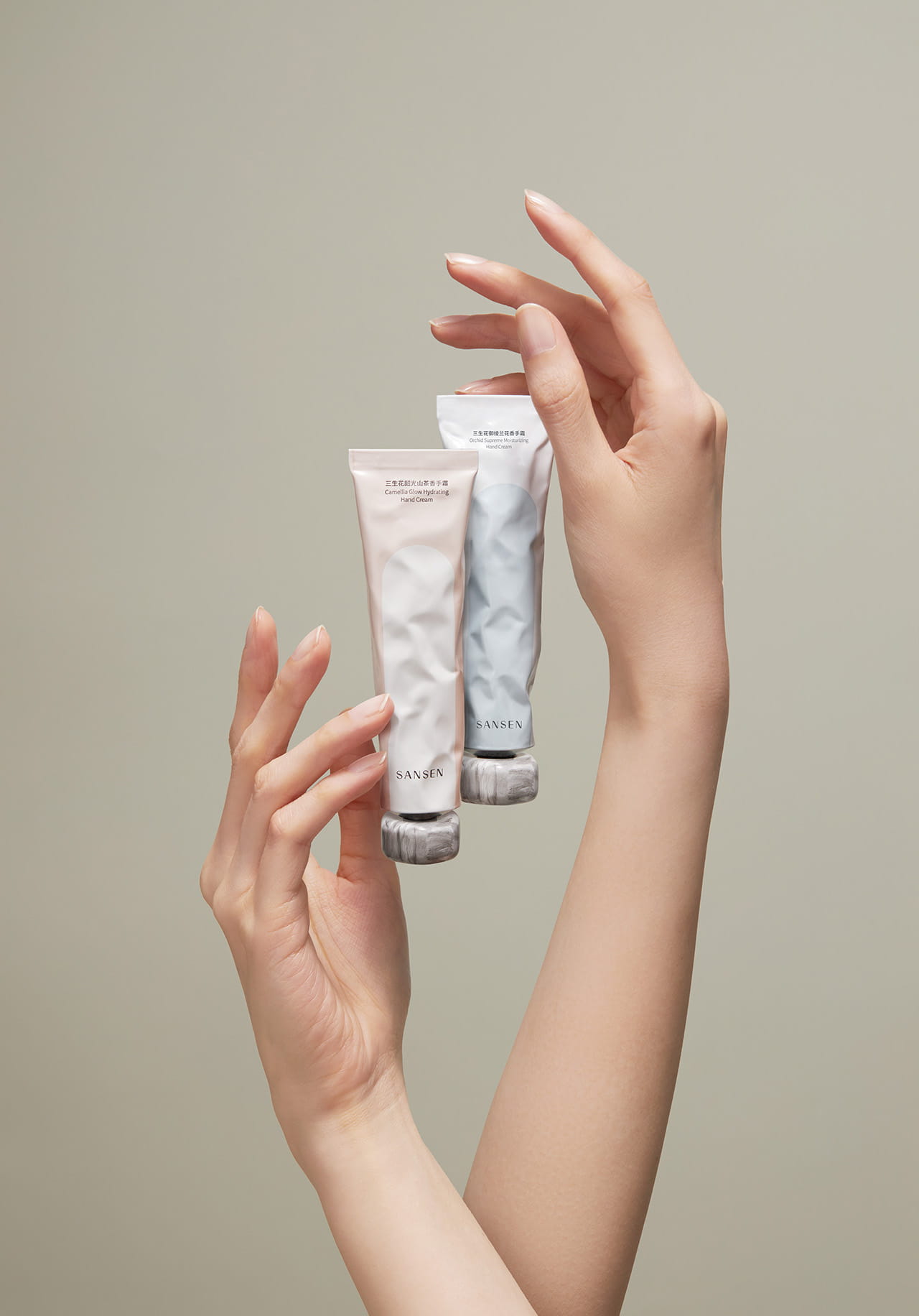
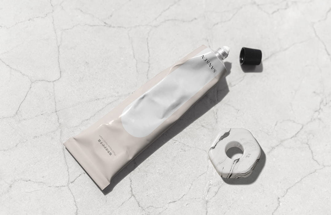
Inheriting the brand’s signature design, the cap of the hand cream boasts a hexagonal part. The part increases the surface area of the cap, enabling the upright placement of the hand cream to save space. Its marble-like texture features a gentle touch, and can be removed and paired with accessories like chains to act as a fashion item.
Inspired by Shikumen, the typical architecture in Shanghai — the origin of the brand, the packaging adopts the archway pattern on its front, which suggests that the product series is a gate traversing the historical currents, and will establish a new image for the brand; the gate, serving as a barrier protecting what’s inside, symbolizes the products’ ability to provide barrier-like protection for the skin of users. The outer box also incorporates the archway element, with flowers blooming within the gate. Gates represent a kind of rational beauty, while flowers embody the most direct expression of emotional beauty. Their combination is intended to deliver the brand philosophy of coexisting rationality and emotion.
设计理念
本包装是为香氛身体护理系列产品设计的,旨在传达品牌希望用户能如鲜花一般,始终为自己盛开的美好祝愿。
该产品以花酿工艺提炼了花植精华,自然科学成分与芬芳花香结合,带给用户生理与心理双重疗愈。基于此,瓶装香氛采用以“花卉”为原型的四瓣花瓶,不仅直观传达出产品核心成分和自然芬芳的特点,而且提供了良好的握持感和放置稳定性。
而护手霜的盖子被打造为六角形,延续了品牌一贯的标志,大面积盖子也便于直立,节省空间。其云石般的质感,不仅带给人温润的触感,还可取下并搭配链条等配件,从而作为时尚单品使用。
而其产品包装正面的“拱门”图案,是品牌起源地上海的代表性元素——石库门的印记,喻示着产品是一扇跨越历史洪流的大门,开启品牌新形象;同时门作为保护内部的屏障,也寓意产品能为用户肌肤提供屏障式的保护。且产品外包装也采用了“拱门”元素,门”中鲜花盛放。“门”的造型是一种理性的美的表达,而花代表最直观的感性美,二者结合,意在传递品牌理性与感性并存的理念。