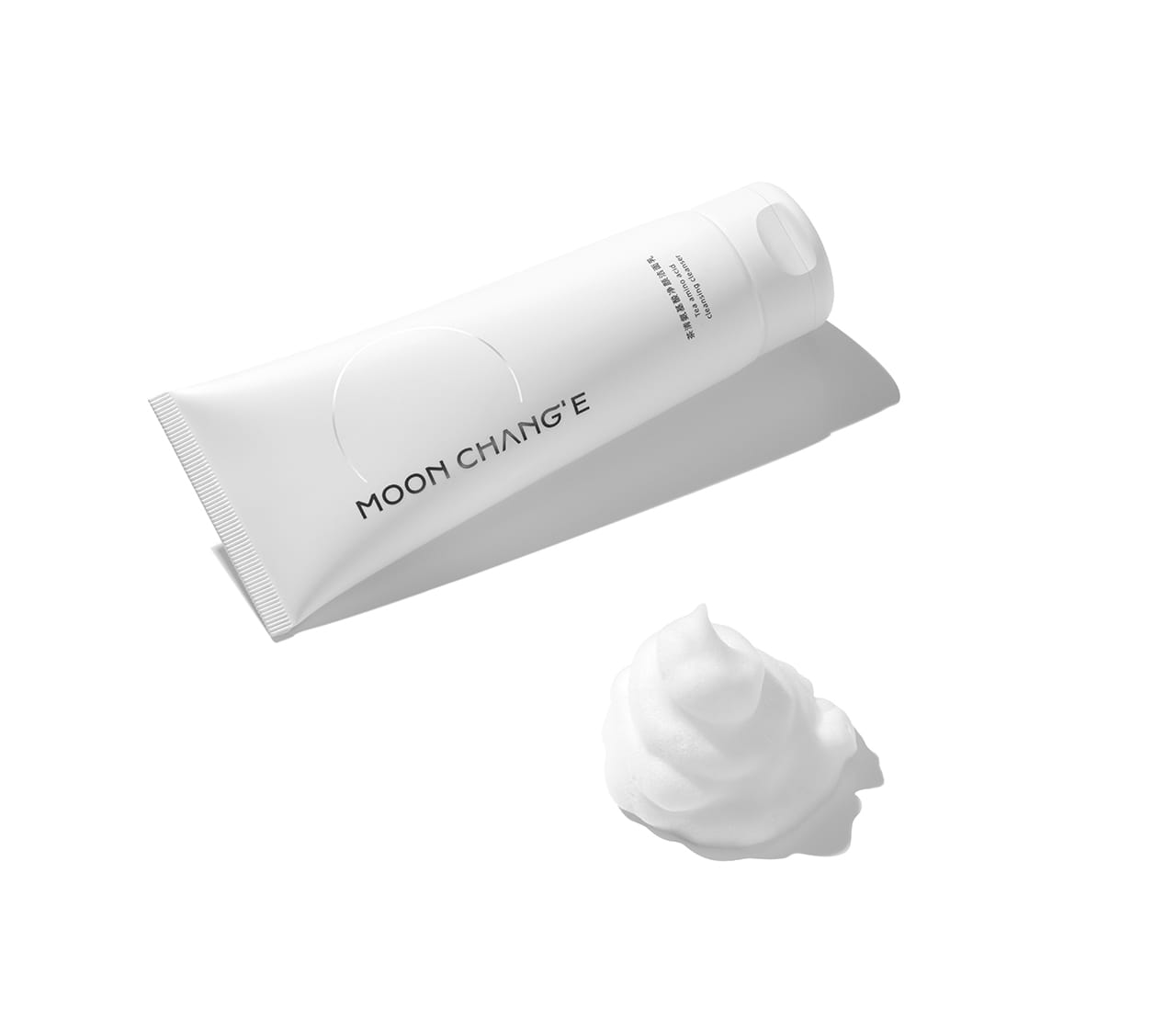
MOON CHANG'E 月里嫦娥
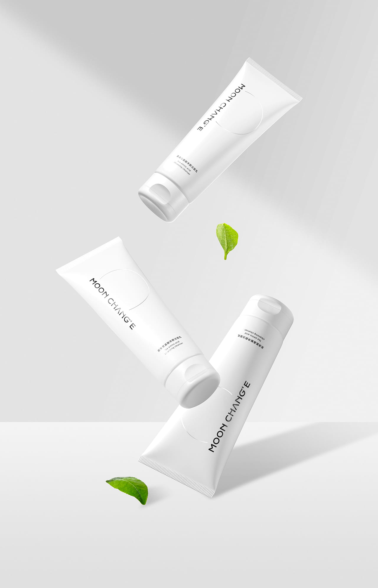
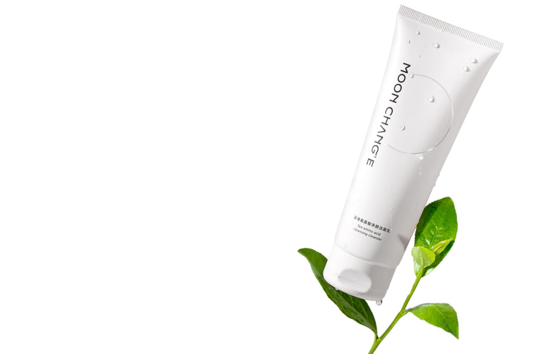
洁面乳 面膜
Idea
The brand packaging design of "MOON CHANG'E" takes Oriental light skin care as the core, integrates tradition and modernity, and is committed to bringing consumers a unique skin care experience. The design inspiration comes from the classical poem "the moon Chang 'e under the wide cold, the human sky and the moon", which means that the brand comes from the celestial realm, the celestial skin care secret to the human world, so that every consumer can feel the unique charm of the brand.
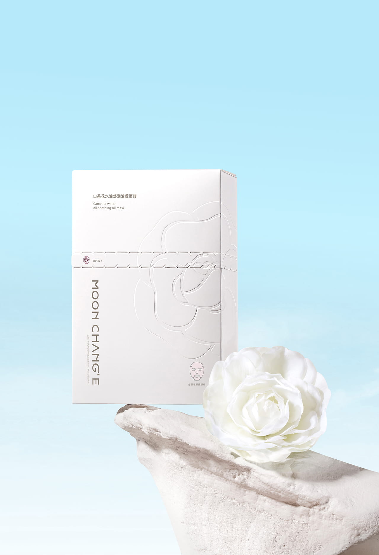
In packaging design, we pursue independence, connotation, and break the brand personality of the box. We use simple but not simple "half moon" line design, show the brand's light and simple style, through exquisite detail processing, unique structure selection, exquisite printing process, so that the packaging highlights the concept of mild safety, simple and efficient.
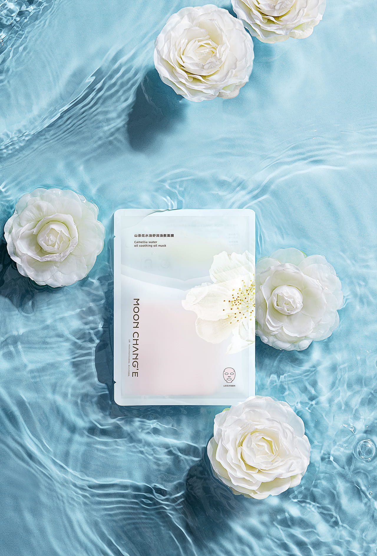
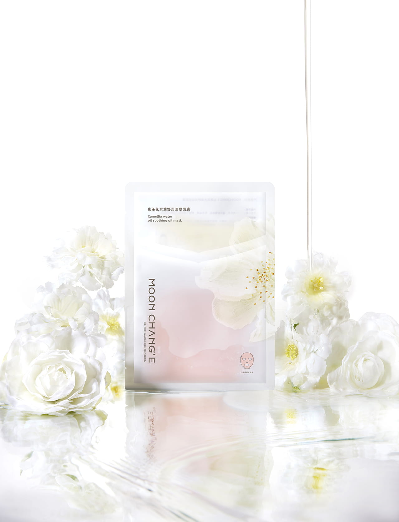
In the use of color, we use white and silver as the main colors to create a technological, cool and elegant atmosphere, which echoes the brand name "MOON CHANG'E". At the same time, the appropriate addition of gold as an ornament, increase the attractiveness of the product and fashion sense.
"MOON CHANG'E" brand packaging design is not only the outer packaging of a product, but also the transmission of brand culture and concept. We hope that through exquisite packaging design, every consumer can feel the unique charm and cultural heritage of the brand, so as to trust and love our products more
设计理念
“月里嫦娥”的品牌包装设计以东方轻护肤为核心,融合传统与现代,致力于为消费者带来一种独特的护肤体验。设计灵感源自古典诗词“月里嫦娥下广寒, 人间天上共婵娟”,寓意着品牌源自仙界,将仙界的护肤秘诀带到人间,让每一位消费者都能感受到品牌的独特魅力。
在包装设计上,我们追求独立、内涵、打破条框的品牌个性。我们采用简约而不简单的“半月”线条设计,展现品牌的轻简风格,通过精致的细节处理、独特的 结构选择、精美的印刷工艺等,使包装突出温和安全、简洁高效的理念。
在色彩运用上,我们以白、银为主色调,营造出科技、清冷、高雅的氛围,与品牌名称“月里嫦娥”相呼应。同时,适当加入金色作为点缀,增加产品的吸引力和 时尚感。
“月里嫦娥”品牌包装设计不仅是一件商品的外包装,更是品牌文化和理念的传递者。我们希望通过精美的包装设计,让每一位消费者都能感受到品牌的独 特魅力和文化底蕴,从而更加信赖和喜爱我们的产品。